
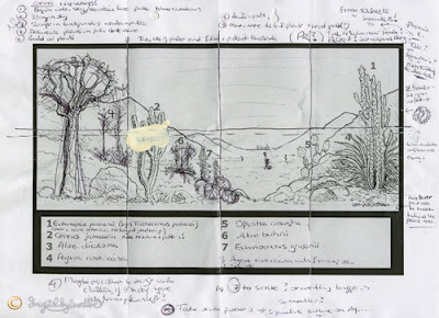
 The cactus mural is now getting very close to completion. Today I wanted to pull together a few things and add detail to some of the plants.
  I began by working a little more into the sandy pebbly foreground. This was to give it a bit more 'finish' to my satisfaction! I have to be careful not to 'overfinish' things - but there was a little I needed to do here ...
 I did the same on the left of the mural. The Aloe dichotoma needs detail on the leaves and also some moulding on the trunk. On the right of the Cereus the Aloe buhrii requires flowers.
 I painted in detail in the leaf rosettes of the Aloe dichotoma using various colour mixes which I had used elsewhere in the painting. I also used an olive green mixed with Ultramarine Blue, Yellow Ochre, Cadmium Red Medium and some Titanium White.
*
For the Aloe buhrii flowers I used Cadmium Yellow Medium, Titanium White and a touch of Cadmium Red Medium.

I have been asked to paint two flowers on the Echinopsis pachanoi, so I decided where to position these. I initially tested them higher up on one of the middle sections, but this didn't look right, so I washed the wet paint off. (One of the conveniences of acrylic!)
 I decided that the position I had chosen on the right of the Echinopsis was good, so I applied an underlay of Yellow Ochre mixed with Titanium white.
 While this was drying, I worked a little more detail into the low trunk of the Cereus. Paler Yellow mixture was also added to the flowers of Aloe buhrii.

The ochre on the Echinopsis flowers had now dried, so I applied a layer of Titanium White, with just a tad of Yellow Ochre mixed in.
 I will let this layer dry overnight before applying the details.
 More detail was added to Aloe buhrii, defining the flowerheads.
 The leaves of Aloe dichotoma were also worked into with more detail. Just before finishing for the day I firmed up my sketched in Agave americana, ready to put the details in tomorrow!

I have been asked to paint two flowers on the Echinopsis pachanoi, so I decided where to position these. I initially tested them higher up on one of the middle sections, but this didn't look right, so I washed the wet paint off. (One of the conveniences of acrylic!)
 I decided that the position I had chosen on the right of the Echinopsis was good, so I applied an underlay of Yellow Ochre mixed with Titanium white.
 While this was drying, I worked a little more detail into the low trunk of the Cereus. Paler Yellow mixture was also added to the flowers of Aloe buhrii.
The ochre on the Echinopsis flowers had now dried, so I applied a layer of Titanium White, with just a tad of Yellow Ochre mixed in.
 I will let this layer dry overnight before applying the details.
 More detail was added to Aloe buhrii, defining the flowerheads.
 The leaves of Aloe dichotoma were also worked into with more detail. Just before finishing for the day I firmed up my sketched in Agave americana, ready to put the details in tomorrow!
Cactus House Mural, University of Durham Botanic Garden


