
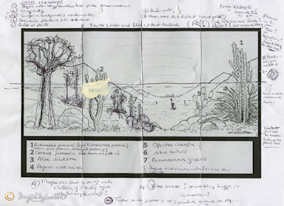
 Today I started by working more into the forms of the rocks on the right, to bring in some mid tones.
 The boulders on the left were also worked into. The mixture I used was more greyish than yesterday, still using Ultramarine Blue, Burnt Umber, Yellow Ochre and Titanium White. This softened the harsh contrasts between the light and shade.
My next task was to add detail to the cacti. Firstly I used a blueish green, with Cerulean Blue, Lemon Yellow, Titanium White and a touch of Burnt Umber, working into the shadow areas of the cactus.

 Next I mixed a mid tone yellowish green, using Cadmium Yellow Medium, Ultramarine Blue, and a little of the grey I had used on the boulders, to tone it down. This was painted onto the barrel shaped cactus and the Cereus.
 I began working on the spiny edges of the Echinopsis using a darker mixture of the same pigments. The highlights set in a lattice type pattern were in a cream colour mixed with Titanium White and Yellow Ochre.
 The Prickly Pear was worked into with the earlier blueish green, using a dry-brush technique to suggest its texture.
 It is always good to stand back and look at the effect of one's work from a distance. Especially when you get to notice a new giant waterlily flower opening beside you!
 This was in bud about 15 minutes ago!
 Cactus House Mural, Durham University Botanic Garden
 Next I mixed a mid tone yellowish green, using Cadmium Yellow Medium, Ultramarine Blue, and a little of the grey I had used on the boulders, to tone it down. This was painted onto the barrel shaped cactus and the Cereus.
 I began working on the spiny edges of the Echinopsis using a darker mixture of the same pigments. The highlights set in a lattice type pattern were in a cream colour mixed with Titanium White and Yellow Ochre.
 The Prickly Pear was worked into with the earlier blueish green, using a dry-brush technique to suggest its texture.
 It is always good to stand back and look at the effect of one's work from a distance. Especially when you get to notice a new giant waterlily flower opening beside you!
 This was in bud about 15 minutes ago!
Below is a photograph which 'went wrong' ... I don't know what I did, it was supposed to be true to colour, but I rather like the green effect!
 Cactus House Mural, Durham University Botanic Garden


No comments:
Post a Comment